|
|
Math 121 - Calculus for Biology I |
|
|---|---|---|
|
|
San Diego State University -- This page last updated 23-Jan-08 |
|
![]()
Sample Lab
This webpage is designed to show you what is expected from two typical computer lab questions. In the process, it will guide you through key steps to creating good Excel graphs for your lab report, showing many of the features that are required in the graphs. In the process, we will demonstrate a couple of valuable techniques in Word to make the lab write-up look better.
1. Consider the quadratic equation given by the function
Find the x and y-intercepts and the vertex of the parabola. Graph f(x) for -3 < x < 3.
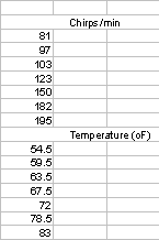
2. The lecture notes show that the folk formula for determining the temperature from the chirping of the snowy tree cricket, Oecanthulus niveus, is given by
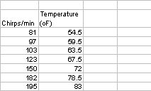
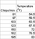
Below is a table with some data collected by C. A. Bessey and E. A. Bessey [1] from crickets chirping in Lincoln, Nebraska in 1897.
|
Chirps/min |
81
|
97
|
103
|
123
|
150
|
182
|
195
|
|
Temperature (oF) |
54.5
|
59.5
|
63.5
|
67.5
|
72
|
78.5
|
83
|
a. Graph the data from the table above and use Excel's Trendline to determine the equation of the best line that fits the data. On your graph include a graph of the folk formula. For the domain of the graph, use 50 < N < 250.
b. Use both the folk formula and the best fit line to determine the temperature if a cricket is chirping at the rates of 60, 80, 100, 140, 180, and 210 chirps/min. Also, determine the expected chirping rate from these formulae for crickets kept at 65oF and 75oF.
[1] C. A. Bessey and E. A. Bessey, Further notes on thermometer crickets, American Naturalist (1898) 32, 263-264.
One of the most common loss of points on labs is the failure to completely answer the questions posed, so it is recommended that you begin the lab by creating a Word document using the web version of the lab. This is best done in Explorer (not Netscape) by copying the document and pasting into a Word document. (You highlight the lab, copy it, then paste it into a New Word document.) If you use Netscape, first select "File" and "Edit page" from the top menu. When you select, it will include the pictures. Save this Word file on your floppy disk- it is not necessary to close it.
Question 1: The first question can be worked using your algebra skills. (Another option will be to take advantage of the power of Maple, which you will be learning in later Computer Labs.) The first part of this problem is easily done on paper. The y-intercept is the easiest to find by evaluating f(0) = 2. The x-intercepts are found by solving f(x) = 0, which is equivalent to solving
This is solved using the quadratic equation (or completing the square if you prefer this easier technique). The quadratic formula gives
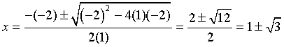
The x value of the vertex for the parabola occurs halfway between the x-intercepts, so this clearly occurs at x = 1. The y value is found by evaluating
Thus, the vertex occurs at the coordinates (1, 3).
Excel is used to create a graph of f(x). The question asks to graph f(x) for -3 < x < 3, so we begin in Excel by creating a table of numbers from x = -3 to x = 3. The rule of thumb for a good graph is to have about 50 points on the graph. Since the difference between the x values is 6, then the x values should be incremented by 6/50 = 0.12. For sake of convenience, we choose an increment size of 0.1, giving 60 points for our function evaluations. (An alternate way to use Excel to graph a function is to use the Graphing Template that is downloadable from this hyperlink and has written instructions on the file.)
The list of x values are placed in the first column of the Excel spreadsheet. This is done by putting a -3 in A2. (Using A1 as a location for the label x.) In A3, we type = A2 + 0.1, which adds 0.1 to -3, giving -2.9. From A3, we fill down until we reach x = 3 at A62. To fill down, you can highlight the elements in the spreadsheet that you want to fill down and follow this by either typing Ctrl-D or going to the Edit item on the menu, finding fill, and selecting down. Alternatively (and simpler), you highlight the cell that you want to fill down from. You move the cursor to the lower right corner until it changes to a simple +. At this point, you move the mouse down to the cell that you want to fill to (A62).
Now we need the function values. Label B1 with y. In B2, you type = 2 + 2*A2 - A2^2, which is just the function f(x) with A2 replacing x and evaluates the function with the x value in A2. Next you fill down Column B from B2 to B62, following the same fill down procedure as noted above.
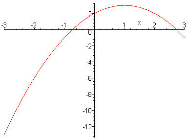
Now we want to graph Columns A and B. First you highlight the data to be graphed, then you click on the icon for Chart Wizard on the toolbar. Select the XY (Scatter) chart type of graph, then select the chart sub-type in the lower right corner (straight lines). (Note that you will almost always select either the default (for data) of points only or the lower right corner and ignore all other sub-types.) Proceed with Next twice to get to the page (Step 3) where you begin by entering a Title and label the axes. For this example, the title given is Quadratic Function with simple x and y labels for the axes. Now select Gridlines and check Major for the x axis, then select Legend and unselect Show legend, as there is only the one graph. At this point, you can select Finish. The result appears as follows.
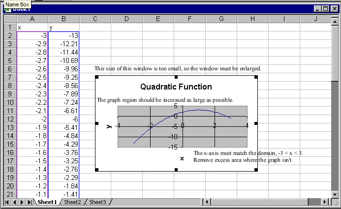
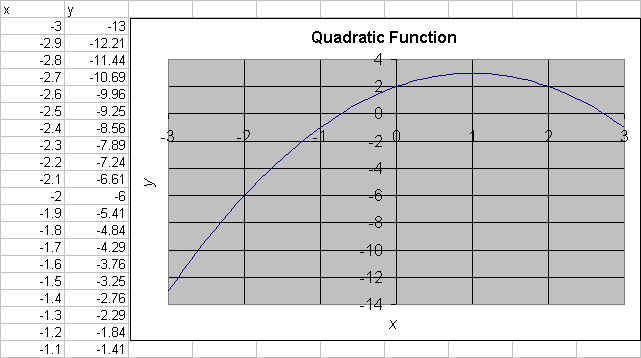
This is clearly a poor looking graph. There are 3 comments that I have entered showing where we need to improve the graph. First the window is increased by moving the mouse to black squares and using the left button of the mouse to increase the viewing frame. I find that about 8 columns and 19 rows is a fairly good size. To adjust the x-axis to the correct domain, you double click when you point to the x-axis and see the label Value (X) axis. In the window that pops up, you select Scale and change the Minimum to -3, the Maximum to 3, and the Major unit to 1. Because the font is oversized, I also select Font and change the font to Regular with Size 12 (points). Similarly, the y-axis can be changed by choosing the Regular font with Size 12. Next I double click on the Value (X) Axis Title, selecting Font, changing it to Italic with Size 12, and moving it down to the edge, then repeat this with the y-axis. The Chart Title is decreased in size by double clicking on the title and changing the Font to Bold Size 12. Finally, you click inside the graph region and once again use the black squares with the left button on the mouse to resize the graph to fill the area. The resulting graph is as follows.
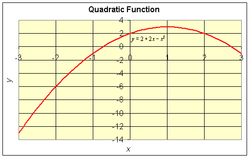
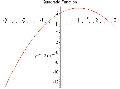
This resulting graph is fine for your report, but I usually make minor changes to further improve the appearance of the graph. By double clicking on the background, you can change the color. The graph line can have its size and color changed by a similar process. Finally, I use Equation Editor in Word to create a good label for the actual equation. The resulting graph appears as follows.
You should save this file onto a floppy disk, so you can retrieve it later. Everything you have put in, including the formatting of the graph, will be saved. It is not necessary to close the file at this time.
Now we are ready to create the actual Lab Report for the first question.
Select your Word file (saved earlier from copying the lab to a Word document), then open it and proceed to the first question. It should appear something like what appears below in the window.
|
1. Consider the quadratic equation given by the function Find the x and y-intercepts and the vertex of the parabola. Graph f(x) for -3 < x < 3.
|
Write in the values for the x and y -intercepts. You are supposed to be learning about technical writing, so you work should appear in complete sentences. Give clear concise answers that demonstrate that you know what the values represent. They are typed here in color so that you can see them more easily. The answers are written in good paragraph form, showing that you understand the problem and can produce the correct answers.
The values in blue below are created in Word using Mathtype Equation or Equation Editor. They are both used in the same way. Click on Insert on the top menu, followed by Object, and then choose Microsoft Equation 3.0 (or alternatively it might say Mathtype or Equation Editor). A second window will open up with symbols which you can insert. In this case, you want to type (1+ followed by the square root icon and a 3 then the right arrow key to indicate that the next part is no longer inside the square root. Follow this with a ,0) and press escape.
|
1. Consider the quadratic equation given by the function Find the x and y-intercepts and the vertex of the parabola. Graph f(x) for -3 < x < 3. The x intercepts occur at
|
Finally, we wish to have the graph in our Lab Report. Open Excel by clicking on the tab at the bottom, so that Excel is in the open window. Click somewhere in the graph, so that the graph border is highlighted, with little black squares at the vertices. Right click and select Copy (or choose Copy under Edit on the menu bar). Now, use the bottom tab to select the Word document, and left click in the document where you want to put the graph. Right-click and select Paste (or alternately choose Paste under Edit on the menu bar).
You can change the shape and position of the graph at this point, but it is easier to do it in Excel before it gets here.
|
1. Consider the quadratic equation given by the function Find the x and y-intercepts and the vertex of the parabola. Graph f(x) for -3 < x < 3. The x intercepts occur at
|
The above answer is an example of a complete solution to the first question. Be sure to Save your file at this point!
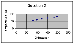
To begin the next question you can either hit enter a couple times to produce a reasonable spacing between problems or go to Insert ( top menu) Break and choose Page break, so that the next question appears on a new page. Below is the first part of Question 2 repeated.
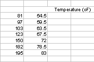
Question 2. The lecture notes show that the folk formula for determining the temperature from the chirping of the snowy tree cricket, Oecanthulus niveus, is given by
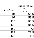
Below is a table with some data collected by C. A. Bessey and E. A. Bessey [1] from crickets chirping in Lincoln, Nebraska in 1897.
|
Chirps/min |
81
|
97
|
103
|
123
|
150
|
182
|
195
|
|
Temperature (oF) |
54.5
|
59.5
|
63.5
|
67.5
|
72
|
78.5
|
83
|
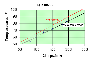
a. Graph the data from the table above and use Excel's Trendline to determine the equation of the best line that fits the data. On your graph include a graph of the folk formula. For the domain of the graph, use 50 < N < 250.
You can start a new excel spreadsheet, or you can click the bottom tab on the Excel sheet you are working in, which gives you a new space to begin the second question. If you want to rename the tab, so you can remember which is which, right click on the tab, and select rename, then type in a new name ( like Question 2 )
In Word, select the table, and copy it. Now go to cell A1 in Excel and Paste.
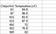
Notice that the information does not appear as it does in the table, it all appears in one column. We need the data in a table with the first column being the Chirps/min or domain of the function and the second column being the Temperature or range of the function.
Click in the middle of cell A10, and hold the mouse button down while you scroll to A17. This selects the cells for temperature. Release the mouse button, and scroll up to the top line in the selection. You will see that the cursor changes to an arrow. At this point, hold the mouse button down, drag the information up to cell B2, and release the mouse button. (Alternately, you can highlight the data, go to Edit on the menu bar, select Cut, then left click in B2 and select Paste under the Edit bar.) There are several ways that you can move the data to where it can be graphed.
Now we can edit the heading cells. Click in the middle of cell A2. In the edit line up at the top, you will see appear
|
|
Click in cell B2, and do the same thing in front of the T, so that it also moves back to the beginning of the line. Use the mouse to click back into the cell before you press Enter.
Right click on cell B2, and choose Format cells. Click the alignment tab, and check the wrap text box.
Now put your cursor up between the A and B labels on the top of the columns. You will see it changes into a vertical line with two arrows. Click and hold the mouse button, and drag the cursor to the right a little, so that the label for the Chirps/min has a little space. Release the mouse button. Do the same for the place between the B and C, until the Temperature label looks good.
Click on cell B2, and go to the edit window.
|
Temperature (oF) |
Select the o from of, and right-click to select Format cells. Select superscript, and okay.
Finally, go to cell B2, and then click the "center" button on the menu
We want to use these data to create a graph showing the points Click in the center of cell A2, hold and drag across to cell B9. This selects the headings and data.
Click on the chart wizard icon, and select the XY Scatter Plot, with only the points showing (the default choice). Click Next. The program should state that your data are in series. Click Next. Use the tabs to navigate through the chart options. There is a lot more help on this in the Excel Help
Fill in the Titles you want for your chart. Under gridlines, make sure to check the Major Gridlines on x-axis box. Remove the check on the Show Legend box, as we only have one set of data. Press Next, and select Save Chart as Object in ...
This produces a small chart which is obviously not very attractive. Use the same guidelines as for Question1 to change the size of the graph, and the scale on the x- and y-axes. Two clicks on the vertical axis will make the text horizontal, so that you can select the o in of, and again right-click to use Format AxisTtitle to make the o into a Superscript.
Change the fonts and the background color so that they closely resemble the chart you made in Question 1. You can change the size and shape of the data point markers by right-clicking on one of them, and selecting Format Data Series.
Right-click on a data point, and select Add Trendline. Choose the Linear trendline, and click the Options tab. Check Display Equation on Chart.
Notice that trendline makes a best fit line which only goes from the lowest to the highest points. To make it cover the entire domain, right-click on the trendline, and select Format Trendline. You can change the color and weight of the line here, but you can also go to the Options tab, and fill in the values to go back and forward - in this case, 31 back and 55 forward should cover the domain 50 < x < 250.
Finally the equation needs to be moved and reformatted to be as indicated. Click on it to select it, then alter the font size and the characters in the usual way. You can also change the number of decimal places displayed using the Number format tab.
Finally, this part of the question asks us to include the line for the folklore formula. In the sheet of data, go to cell A12, and type in N In B12, type T. In A13 put the value 50, and in A14 put the value 250. In B13 type the equation =A13/4 +40. Click in the middle of the cell, and move the cursor over to the small square on the lower right of the cell. You will see that the cursor changes shape. While the cursor is a different shape, click hold and drag the mouse down to cell B14. Release. This copies the equation.
We want to add this data in to our graph. Right-click on the graph, and select Source data. Click the Series tab, and select add. In the Name box, type Folk formula. In the x-values box, click on the small red arrow on the right. This window rolls up and allows you to click in the middle of A13, hold and scroll to A14, then release. Click on the small red arrow to get the window back. Do the same for the y-values, selecting B13 and B14, and press okay. The program produces two markers for the two data points. However, we would like a line. Put the cursor over one of these points, and right click Select Format Data series, and then choose a line and no marker.
Finally, select the text maker at the bottom of the screen to add a text box to the graph, which can be moved to identify the new line
Make sure that all items asked for in the question are included in the graph, and then use the previous copy and paste technique to put the graph into your Word document
|
a. Graph the data from the table above and use Excel's Trendline to determine the equation of the best line that fits the data. On your graph include a graph of the folk formula. For the domain of the graph, use 50 < N < 250.
The best fit line, from Excel's Trendline, is T=0.23N+37.68 |
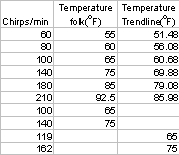
b. Use both the folk formula and the best fit line to determine the temperature if a cricket is chirping at the rates of 60, 80, 100, 140, 180, and 210 chirps/min. Also, determine the expected chirping rate from these formulae for crickets kept at 65oF and 75oF.
Now you want to calculate the values of T for given chirp rates. Return to your sheet. In cell A17 and below (to A22), type in the values of chirp rate you wish to use. Put a title up above this in cell A16. Click in the middle of cell B14, and then chose Copy. Click in cell B17, and Paste, to put in the formula. Use the copy technique to put this formula in all cells B17 to B22.
Next you want to create a new column with calculations for the trendline fit, so put a title in cell C16. In cell 17 type the equation = A17*0.23 + 37.68. Copy and paste the formula, and then select the cells and click on the decimal point reducer, to have the display be a reasonable number of decimal points.
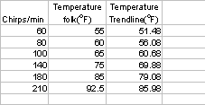
Finally, you will want to determine the inverse of the formulae, so that you can calculate the chirps/min. For the folk formula, N=(T-40)*4, and for the trendline formula, N=(T-37.69)/0.23 Type the values and equations into the appropriate cells ( here is a view showing all the formulae)
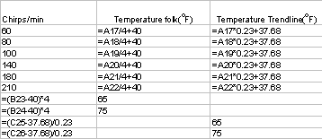
Finally, to paste a neat table into your report, select the cells from A16 to C26, copy , and paste into your Word Lab report.
|
a. Graph the data from the table above and use Excel's Trendline to determine the equation of the best line that fits the data. On your graph include a graph of the folk formula. For the domain of the graph, use 50 < N < 250.
The best fit line, from Excel's Trendline, is T=0.23N+37.68 b. Use both the folk formula and the best fit line to determine the temperature if a cricket is chirping at the rates of 60, 80, 100, 140, 180, and 210 chirps/min. Also, determine the expected chirping rate from these formulae for crickets kept at 65oF and 75oF The data have been used to calculate the values shown in the table below. At 65oF the Folk Formula anticipates 100 chirps/min, whereas the formula we calculated above says we should expect 119 chirps/min. At 75oF , the folk formula says we should have 140 chirps/min, but our formula suggests 162 chirps/min.
|
Save your Word file and your Excel file on a floppy disk.
Now, create a new Word file, and do
Of course, in the future you will not have to use both these techniques, but they are each better for different applications, so you need to know both.
Begin the lab by creating a Word document using the web version of the lab. Save this Word file on your floppy disk- it is not necessary to close it.
Question 1: Now open Maple. It will begin with a prompt on the left
|
[> |
|
> f:=x->2+2*x-x^2; |
Now you want Maple to find the intercepts for you. The y -intercept is where x=0, so at the prompt put in
|
> f(0); |
The x-intercepts are where f(x) = 0, so at the prompt put in
|
> solve (f(x)=0); |
We wish to know the vertex, by putting in the value of x=1, midway between the two y-intercepts,
so type in
|
> f(1); |
Finally, we wish to have Maple draw a graph
If we use the command
|
> plot(f(x),x=-3..3); |
A more sophisticated plot can be made by
|
> plot(f(x),x=-3..3, axes=NORMAL, labels=["x", "y=2+2x-x^2" ], title = "Quadratic Function"); |
Generally, in labs you will use Maple when the question asks for a sketch.
The graph can be put ( "imported") into your Word file by the same process as for Excel. Click on the graph, and then right click and select copy. Open the Word document, click where you want the graph to go, then right click and select paste.
Because the second question specifies the use of Excel, you should use Excel to answer it.
Save your Lab file. It should be a different name than the one you are using for you Excel version.